Color is the invisible architecture of a room. Before a single piece of furniture is placed or a single accessory chosen, color sets the emotional temperature of the space, determines whether a room feels expansive or intimate, energizing or calm. In a bedroom, where the quality of rest is directly linked to the quality of the environment, the color decisions you make carry genuine consequences. Elegant modern bedroom color combination ideas go far beyond choosing a single wall color. They involve understanding the relationships between tones, the way light transforms hues throughout the day, and the role that texture and material play in how color reads in a three-dimensional space. This guide takes you through the most compelling color combinations for contemporary bedrooms, with specific pairings, material suggestions, and the design logic behind each choice, so you can make decisions with both confidence and sophistication.
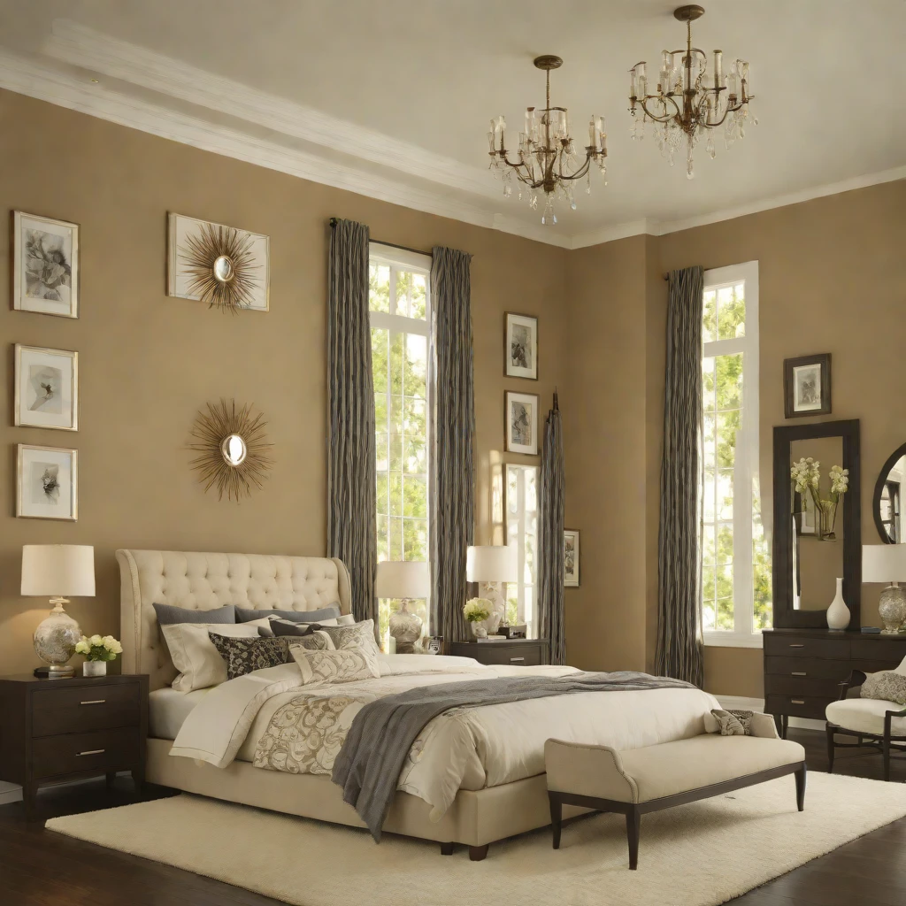
1. Warm White and Natural Oak: The Classic Modern Foundation
Few color combinations are as enduring or as difficult to improve upon as warm white walls paired with the golden tones of natural oak. This pairing works because both elements share a warmth that prevents the white from reading as clinical while the oak’s grain and variation keep the space from feeling flat. Together, they create a room that feels simultaneously fresh and grounded, contemporary and inviting.
The key is choosing the right white: a warm white with a yellow or pink undertone, such as Farrow and Ball All White or Benjamin Moore White Dove, rather than a cool blue-white that sits uncomfortably against the gold of the wood. Pair this with natural oak flooring or furniture in a matte, unsealed finish, and add bedding in a warm ivory or pale stone to complete the layering of warm neutrals.
2. Sage Green and Warm Linen: A Sophisticated Organic Pairing
Sage green has become one of the defining colors of contemporary bedroom design, and its enduring popularity is entirely earned. As a wall color, it occupies a rare position in the spectrum: it reads as green enough to feel natural and fresh, yet its gray-brown undertones keep it firmly in the neutral family, making it extraordinarily easy to pair with warm natural materials. Against warm linen bedding, textured rattan furniture, and pale wood surfaces, sage green creates a room of remarkable beauty and quiet.
Use sage green across all four walls for a cocooning, enveloping effect that heightens the room’s sense of retreat. Pair with cream or warm white ceiling and trim for definition. Stonewashed linen in warm ivory on the bed, a natural jute rug on the floor, and a single piece of terracotta-toned ceramic on the nightstand create a color story that feels drawn from the natural world rather than a paint chart.
3. Charcoal and Warm Brass: Drama with Depth
A bedroom anchored in deep charcoal is a bold, sophisticated choice that rewards confidence. Charcoal walls create an enveloping, intimate atmosphere that is particularly beautiful in a room used primarily at night or in rooms with good artificial lighting. The key to making charcoal work rather than feel oppressive is the quality of what you introduce against it. Warm brass fixtures, natural linen bedding in off-white or pale stone, and raw wood surfaces glow against charcoal in a way that feels genuinely luxurious.
Use a matte charcoal paint, such as Farrow and Ball Railings or Little Greene Paean Black, on three walls, and reserve a fifth lighter tone for the ceiling and trim to prevent the room from becoming a closed box. A pair of brushed brass wall sconces flanking the bed doubles the light output while adding the warm metallic note that elevates charcoal from dark to dramatic.
4. Dusty Rose and Warm Greige: Effortlessly Feminine and Modern
The pairing of dusty rose with a warm greige (gray-beige) is one of the most quietly sophisticated color combinations available to the bedroom designer. Unlike stronger pinks, dusty rose has enough gray in its composition to read as a true neutral, bringing warmth and softness to a room without the sweetness or juvenility that brighter pinks carry. Against a greige wall, dusty rose bedding or a dusty rose upholstered headboard reads as entirely adult and thoroughly modern.
The success of this pairing depends on ensuring that both colors share the same warm undertone. A cool-toned dusty rose against a warm greige will feel disconnected. Look for a rose that leans toward the terracotta-salmon end of the spectrum rather than the cool-pink end. Velvet cushions in dusty rose against a warm greige linen headboard, with oak nightstands and warm brass lamps, create a bedroom that is simultaneously feminine, modern, and undeniably elegant.
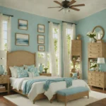
5. Deep Teal and Warm Cream: Rich, Enveloping, and Timeless
Deep teal is one of the most versatile dramatic colors available to the bedroom. Its blend of blue and green means it works harmoniously with both cool-toned neutrals and warm ones, while its depth creates an extraordinary sense of enclosure and intimacy. Against warm cream, it is at its most beautiful: the contrast is high enough to be dramatic but the warmth of the cream prevents the combination from feeling cold.
Use deep teal on the headboard wall only, painting it from floor to ceiling as a confident color plane behind the bed. Dress the bed in warm cream linen, add aged brass hardware on the furniture and fixtures, and bring in a patterned rug that references both the teal and cream tones. The result is a room of genuine depth and elegance that balances boldness with comfort.
6. Terracotta and Warm White: The Mediterranean Modern Palette
Terracotta has returned to bedroom design with a confidence and sophistication that erases its 1970s associations entirely. As a wall color in a modern bedroom, terracotta provides extraordinary warmth, a grounding earthiness, and a sense of connection to sun-baked landscape and artisanal material that no other color replicates. Against warm white, it creates a combination that feels simultaneously ancient and thoroughly contemporary.
Choose a terracotta with enough pink in it to feel warm rather than dull: Farrow and Ball Templeton Pink or Edward Bulmer Red Earth are reliable options. Dress the bed in all-white stonewashed linen and leave the furniture in natural pale wood to keep the warm terracotta from overwhelming the space. A handmade ceramic table lamp in an earthy glaze connects the wall color to the objects in the room and ties the palette together beautifully.
7. Navy and Warm Gold: Regal and Deeply Restful
Navy blue is one of the most sleep-inducing colors in the spectrum, and its combination with warm gold accents creates a bedroom palette of almost royal richness. Navy walls absorb light beautifully, creating the low-stimulus visual environment that the bedroom requires, while gold introduced through frames, hardware, and light fittings prevents the room from feeling heavy or closed.
A soft, slightly muted navy is preferable to a hard midnight blue for a bedroom setting. Farrow and Ball Hague Blue or Little Greene Blue Pale are more liveable in this context than pure navy, offering depth without the visual density of a true dark tone. Layer the bed with warm white and gold-toned textiles, add a vintage-style brass floor lamp beside the bed, and introduce a natural wool rug in a warm geometric pattern to anchor the color combination.
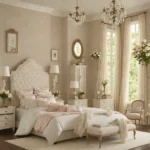
8. Mushroom and Ivory: The Ultimate Quiet Luxury Palette
The quiet luxury movement in interior design has elevated a family of colors that previously felt safe but unremarkable: mushroom, greige, warm taupe, and ivory. In combination, these tones create rooms of extraordinary sophistication and the kind of understated elegance that is genuinely difficult to achieve with more dramatic palettes. Everything in the room coheres, and the eye rests completely.
The success of this palette depends entirely on variation within the narrow range. A mushroom wall should be a noticeably different tone from the warm ivory ceiling, which should be distinguishable from the pale greige linen of the duvet, which should differ from the darker taupe upholstered headboard. These subtle distinctions create the sense of layered depth that prevents the room from reading as a single flat color. Cashmere-soft textiles in warm ivory and stone, with matte unlacquered brass fittings, complete this picture.
9. Forest Green and Natural Linen: Deep, Grounded, and Organic
Forest green grounds a bedroom in a way that no other color does. It borrows the restoring quality of being surrounded by trees and plants and brings it indoors, creating a space that feels simultaneously stimulating and calming. Against natural linen, it loses any potential coldness and instead reads as a rich, living color that changes character beautifully through the day as the light shifts.
Use forest green on all four walls for maximum impact, or apply it to just the headboard wall as a bold, deeply saturated accent. The bed in warm linen provides the necessary contrast, while natural wood furniture and woven accessories in rattan or jute reinforce the organic character of the combination. Introduce indoor plants to complete the connection to the natural world.
10. Slate Blue and Warm Putty: Calm, Considered, and Deeply Modern
The combination of slate blue and warm putty occupies a design space that feels entirely contemporary: sophisticated without being dramatic, calming without being bland. Slate blue shares qualities with both gray and blue, making it a chameleonic color that reads differently under different lighting conditions, sometimes more blue, sometimes more gray, always interesting.
Pair slate blue walls with warm putty or pale mushroom-toned bedding, light oak wood surfaces, and a single ceramic table lamp in a clean sculptural form. This palette is particularly effective in bedrooms that receive good natural light, where the slate blue shifts and deepens through the day in a way that keeps the room visually engaging. A natural wool rug in warm stone ties the floor to the bedding and prevents the blue from floating without an anchor.
11. Understanding Undertones Before You Choose
The single most important technical concept in bedroom color selection is undertone. Every color, including whites and grays, has an underlying hue that becomes visible when placed against other colors or in different lighting conditions. A warm gray with a pink undertone will clash with furniture in a cool silver finish. A white with a green undertone will feel cold against warm wood tones. Understanding the undertone of every color in your palette before committing to it is the difference between a room that coheres and one that perpetually feels slightly off.
The most reliable way to test undertones is to view paint swatches against your existing furniture and flooring materials under both natural and artificial light at different times of day. Paint swatches in large-format samples directly on the wall, at least A4 size, and live with them for several days before deciding. The color you see on a small chip in a paint shop tells you very little about how it will read at scale in your specific room.
12. The Role of Sheen in Color Combinations
Sheen level dramatically affects how a color reads in a room, particularly in the bedroom where light levels vary significantly between day and evening. Matte finishes absorb light and make colors appear richer, deeper, and more saturated, which is ideal for bedrooms where a cocooning quality is desirable. Eggshell finishes add a subtle reflection that brightens a color slightly, making them ideal for darker tones where some light bounce is welcome.
As a general rule, bedroom walls and ceilings benefit from matte or dead-flat finishes, while woodwork and trim can carry a slightly higher sheen for definition and durability. Avoid high-gloss finishes on walls in bedrooms, as they are visually stimulating in a way that works against rest and amplify every imperfection in the wall surface.
Pro Tips for Getting It Right
- Test your palette against all your light sources: Natural light changes the character of every color through the day, and evening artificial light can make a color look completely different from how it appears at noon. Always evaluate your chosen palette in the room under every light condition you will experience there before committing to large amounts of paint or fabric.
- Follow the 60-30-10 rule as a starting framework: This classic design principle suggests that your dominant color should cover roughly 60 percent of the room (walls and large furnishings), your secondary color about 30 percent (bedding, curtains, and upholstered pieces), and your accent color the remaining 10 percent (cushions, hardware, and accessories). It prevents any single color from dominating or competing.
- Keep your ceiling lighter than your walls: Even in dark, dramatic bedroom schemes, a ceiling that is slightly lighter than the walls prevents the room from feeling cave-like. Use a tinted version of your wall color, reduced by about 50 percent, for a ceiling that feels cohesive but distinct. This simple technique preserves the sense of height and openness that every bedroom needs.
- Use fabric and texture to alter how color reads: The same color on a smooth matte wall will look subtly different on a textured linen, a velvet cushion, or a brushed wool throw. This natural variation within a single color is what gives layered rooms their depth and richness. Choose textiles in your chosen hue rather than trying to match them exactly to your wall color.
Color in the bedroom is a deeply personal choice, and no guide can prescribe the precise combination that will feel right in your specific room with your specific furnishings and your specific relationship to light and space. What these ideas provide is a framework: an understanding of why certain pairings work, what to look for in the undertones and textures that support a color story, and how to build a palette with intention rather than accident.
The most beautiful bedroom color combinations share one quality: they feel inevitable, as if no other choice could have been right. That sense of inevitability comes not from following rules but from understanding the principles well enough to trust your own instincts. Start with the combination that genuinely moves you, test it carefully, and build with patience. The room you create will be worth every thoughtful decision.
No Comments