
If you have ever stared at a blank living room wall, wondering how designers always get those perfect gallery moments, you are in the right place. Styling living room artwork is one of the easiest ways to shift the entire personality of a space. The right art layout can balance your furniture, add visual rhythm, and instantly lift the mood of the room. As an interior designer, I always tell clients that choosing beautiful art is only half the story. How you arrange it is where the magic truly happens.
In this guide, we will walk through the 23 trendy art layouts designers swear by. Each one includes practical tips so you can confidently recreate the look at home. Whether your style leans modern, eclectic, minimal, or colourful, there is something here that will spark your imagination.
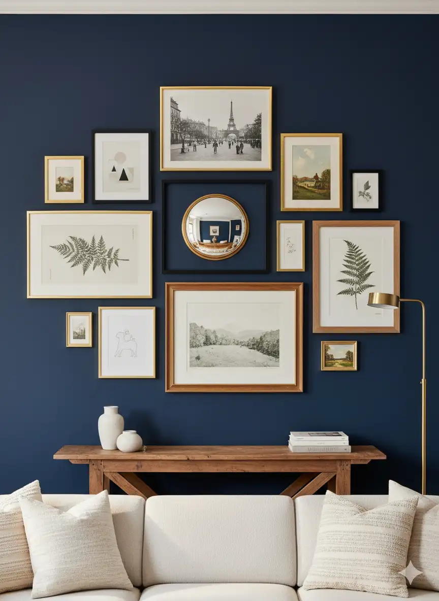
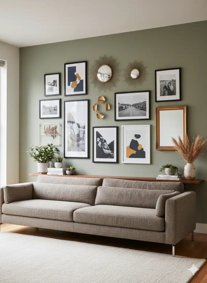
1. The Balanced Gallery Wall
A balanced gallery wall is perfect for anyone who loves variety but still wants a sense of order. You use frames of different sizes but keep the spacing consistent to create visual harmony.
Why designers love it:
- Creates an organized yet artistic look.
- Let’s you showcase photos, prints, and mixed media in one place.
- Works beautifully above a sofa or console.
Pro tip: Lay out your frames on the floor first to test the composition. This avoids unnecessary holes in the wall.
2. The Symmetrical Pairing
Two matching frames placed side by side create a calming and polished look. This is ideal for minimalists who want something simple that still feels intentional.
Best use cases:
- Above a long sofa.
- Flanking a window or doorway.
- On a narrow wall where clutter would overwhelm the space.
Choose artwork that shares similar tones or subject matter to maintain the symmetry.
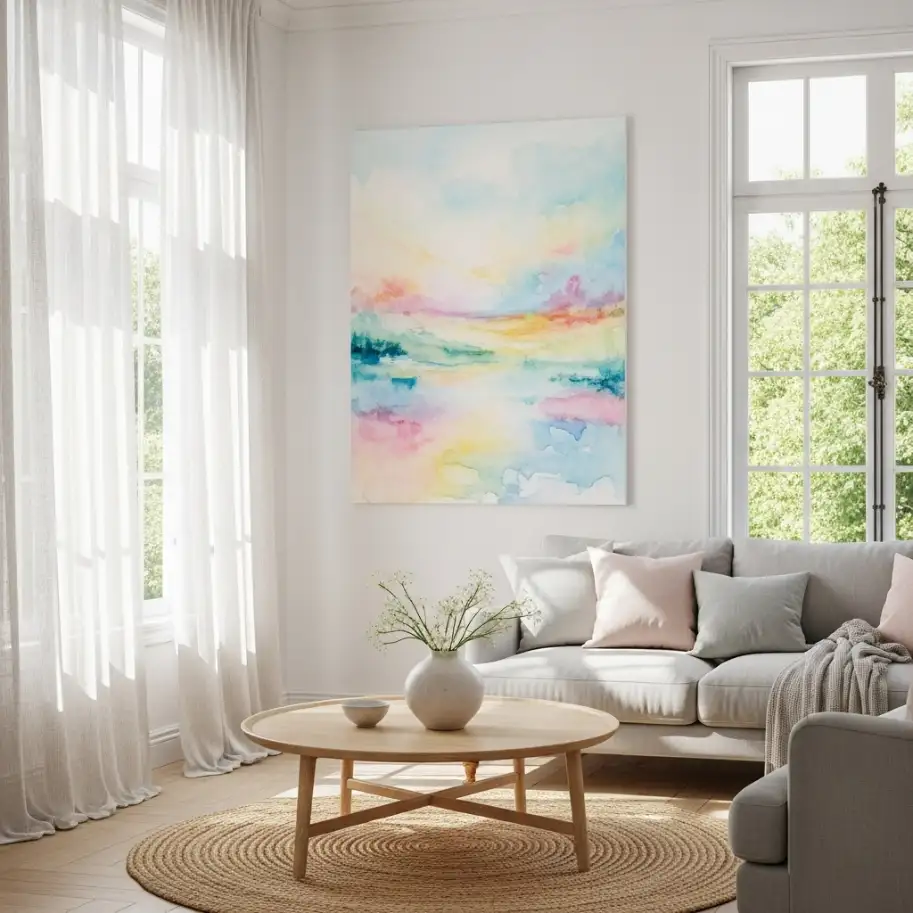
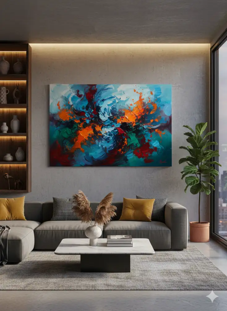
3. Oversized Statement Art

One large piece of art can instantly anchor your living room. It sets the tone for the entire space without needing additional styling.
Why it works:
- Makes a bold impact.
- Minimizes visual noise.
- Perfect for contemporary or modern living rooms.
Go for a canvas or framed print that spans at least two-thirds of the sofa’s length for a proportional look.
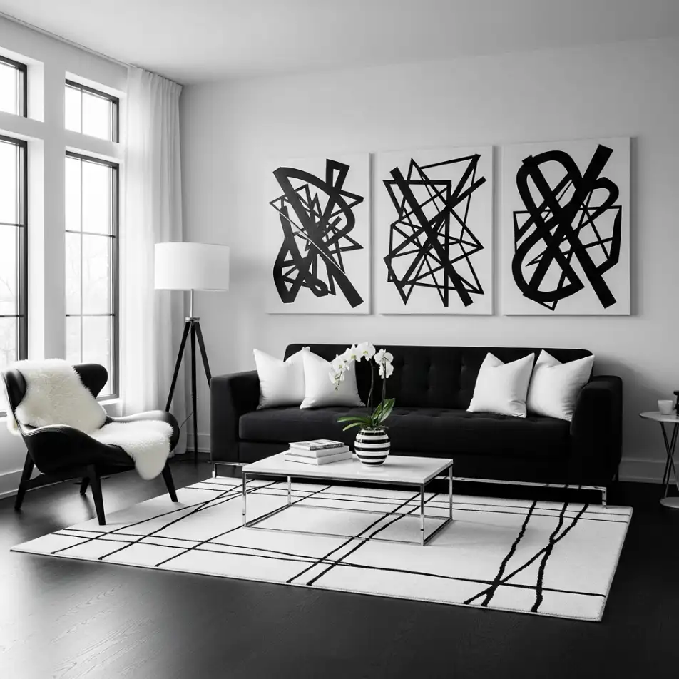
4. Triptych Layout

A triptych is a classic design choice where one image is split into three coordinated pieces. It creates a sense of flow and elongates the room.
Designer insights:
- Keeps the space cohesive even with large wall areas.
- Looks especially striking above a sectional.
- Adds modern sophistication without feeling too busy.
Keep equal spacing between the panels so the lines stay clean.
Xylon Interiors – Redefining the Art of Interior Living
5. The Grid Wall
A grid layout brings structure and geometry to a living room. You use identical frames arranged in neat rows and columns.
Why designers swear by it:
- Ideal for photography series or minimalist art.
- Works well in Scandinavian, modern, and transitional interiors.
- Creates an architectural feel that elevates the room.
Aim for equal spacing between every frame for a crisp and curated appearance.
6. Leaning Art on a Console

Instead of hanging everything, leaning artwork on a console gives your living room a relaxed and sophisticated vibe. You can layer pieces for dimension and depth.
Why this style is trending:
- Easy to switch out seasonally.
- Adds warmth and personality.
- Works when you want a no-commitment approach to wall decor.
Pair artwork with candles, books, and plants for a complete styling moment.
7. Layered Art on Shelves
This layout uses open shelving to create an artful display. Mix framed artwork with decor objects for a curated studio feel.
Benefits:
- Adds height variation and texture.
- Allows endless re-styling without drilling holes.
- Works well for renters.
Stick to a consistent colour palette so the shelf does not look cluttered.
8. Picture Ledge Gallery

Picture ledges are one of the most flexible options for living room artwork. They allow you to swap art easily while keeping your layout neat and intentional.
Why designers love picture ledges:
- Perfect for evolving art collections.
- Great for family rooms or creative spaces.
- Adds layers without feeling heavy.
Mix tall and small frames to create a dynamic composition.
9. The Vertical Stack
A vertical stack uses two to four pieces arranged straight up and down. It draws the eye upward and adds height to the room.
Where it shines:
- Narrow wall sections.
- Next to bookshelves or doorways.
- Small apartments where wall space is tight.
Use frames with similar colours to keep the layout visually cohesive.
10. The Horizontal Lineup

This layout features a series of frames hung in a straight horizontal line. It visually widens the room and creates a calm, orderly feel.
Perfect for:
- Walls behind long furniture.
- Minimalist interiors.
- Photo sets or art prints with similar styles.
Equal spacing is essential to keep the clean look intact.
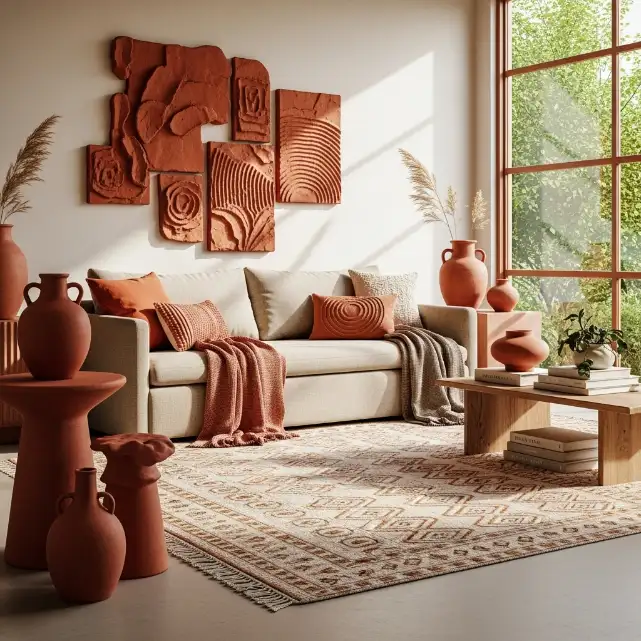
11. Mixed Media Collage Wall

A mixed media collage wall mixes paintings, prints, textile art, sculptural pieces, and even mirrors. It is full of personality and perfect for eclectic interiors.
Why designers recommend it:
- Adds texture and depth.
- Tells a story through different materials.
- Creates a one of a one-of-a-kind focal point.
Use a colour palette that ties everything together so the display feels intentional rather than chaotic.
12. The Corner Art Cluster

Most people forget that corners can hold just as much personality as main walls. A corner art cluster uses two adjoining walls to create a cozy wraparound moment.
Why it works well:
- Turns an awkward corner into a design feature.
- Adds depth and visual interest from different angles.
- Perfect for small living rooms where every inch matters.
Choose pieces that flow visually from one wall to the next so the layout feels connected.
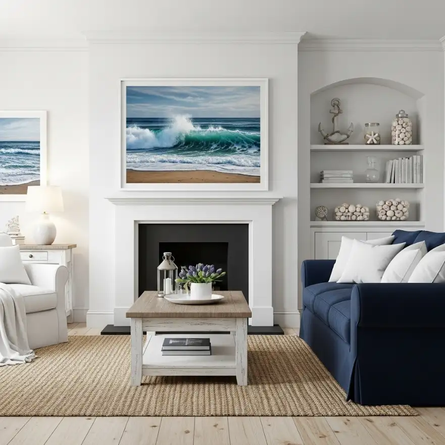
13. Art Above the Fireplace Mantel
The area above the fireplace is a classic spot for living room artwork. You can go with one large piece or a layered arrangement of smaller frames.
Designer tips:
- Keep the scale proportional to the mantel width.
- Try a landscape painting for a calm, grounded vibe.
- A framed mirror also works if you want a mix of art and reflection.
The fireplace already acts as a focal point, so let the art enhance rather than overpower it.
14. Floating Art With Accent Lighting

Floating art paired with subtle picture lights creates a luxurious gallery effect. It gives your wall a warm glow and highlights the textures in the artwork.
Why designers love this approach:
- Adds mood and ambiance during evenings.
- Makes the artwork look more elevated.
- Works beautifully in contemporary interiors.
Stick with soft, warm lighting to avoid harsh shadows.
15. Diptych Layout
A diptych layout features two coordinating pieces displayed together. It has the same elegance as a triptych but with a softer, more relaxed feel.
Best uses:
- When you want symmetry without too much repetition.
- Above a loveseat or console table.
- For art that comes in pairs or similar themes.
Keep the spacing tight so the pair reads as a single composition.
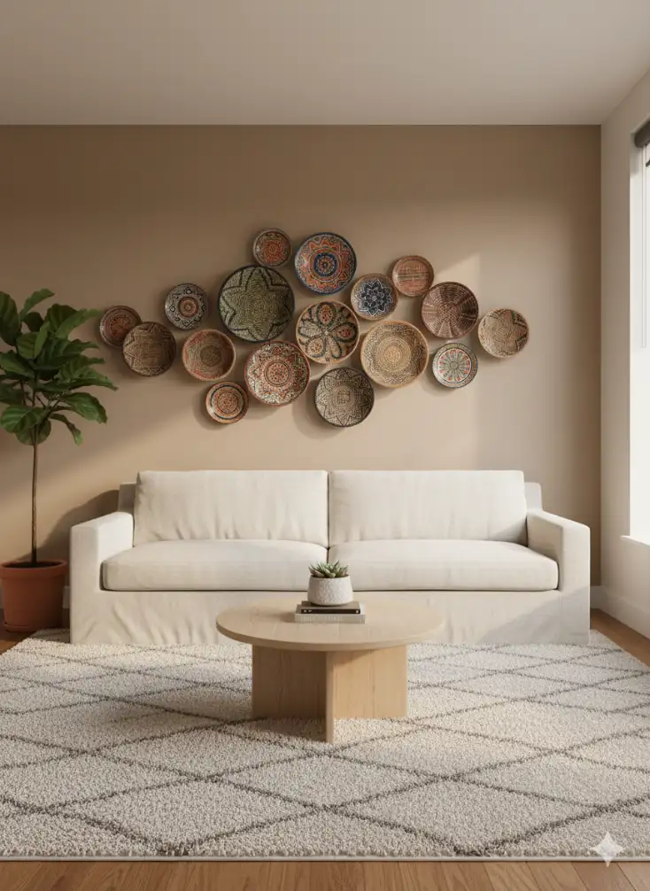
16. The Organic Free Form Gallery
Instead of perfect lines or grids, this layout uses a natural, playful arrangement. Pieces are hung in a flowing shape that feels artistic and spontaneous.
Why this is trending:
- Adds personality without perfection.
- Great for boho or creative interiors.
- Allows you to mix different shapes and frames.
Start with the largest piece as your anchor and build outward.
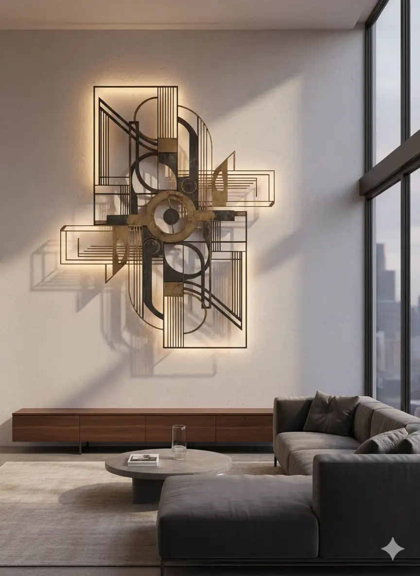
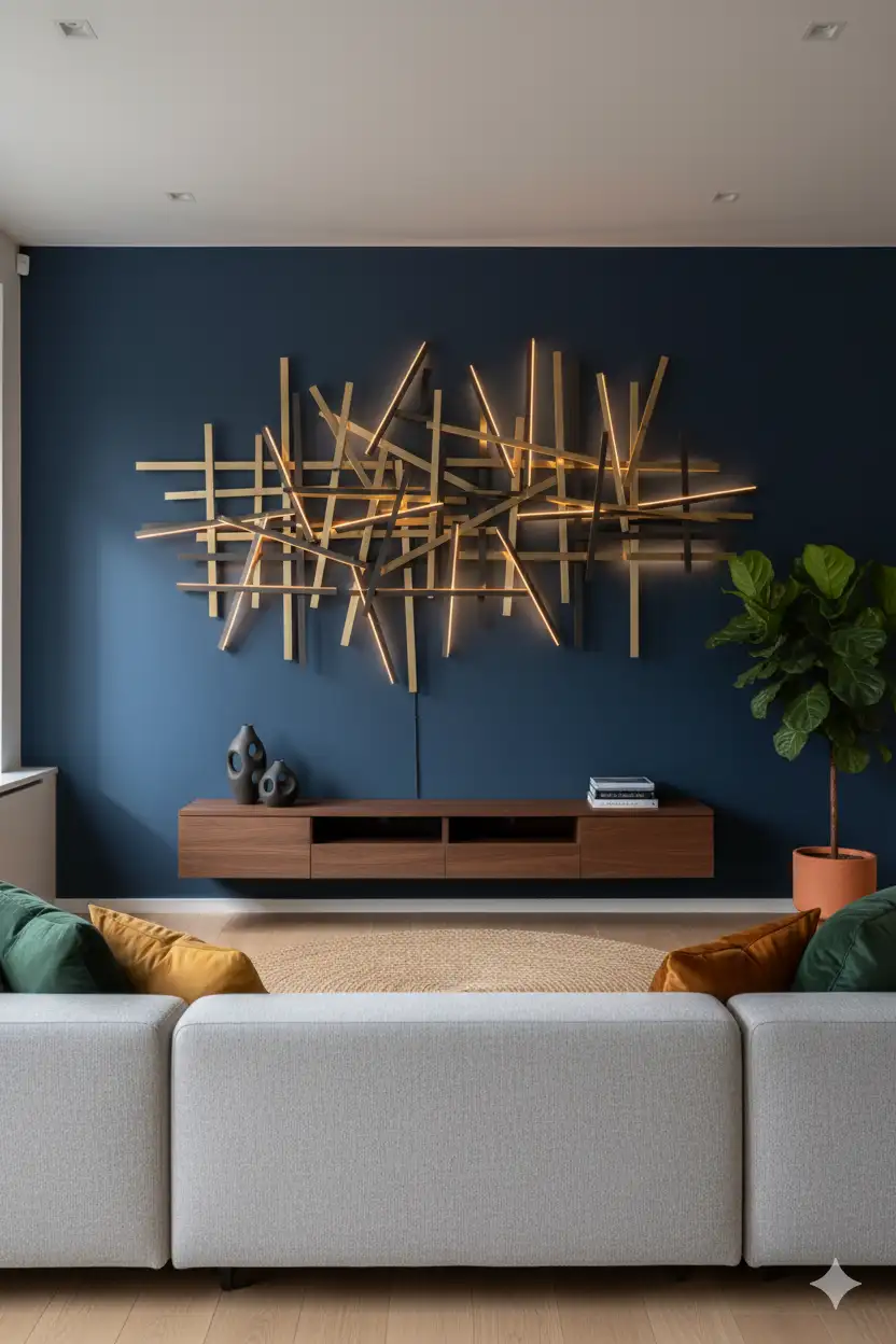
17. Sculptural Wall Art Layout
If you want more texture in your living room artwork, sculptural pieces bring dimension and shadow play. Think metal art, woven pieces, or carved wood panels.
Designer insights:
- Breaks up flat wall surfaces.
- Adds an artisan feel to the room.
- Works well mixed with canvas art for added interest.
Just keep the overall palette coordinated so the wall still feels intentional.
18. The Shelf to Ceiling Art Climb

This layout features art displayed from a low shelf all the way up toward the ceiling. It creates a dramatic vertical flow and draws the eyes upward.
What makes it special:
- Adds height and grandeur.
- Perfect for rooms with tall ceilings.
- Provides a curated, gallery-inspired look.
Vary the frame sizes slightly for a more natural ascent.
19. The Mirror and Art Combo Wall

Mirrors mixed with artwork help bounce light around the living room. This is great for small spaces or dark corners.
Why it works:
- Adds brightness and depth.
- Brings a unique blend of reflection and art.
- Creates movement and visual layering.
Choose a mirror with a frame that complements the rest of your art pieces.
20. The Asymmetrical Focal Layout
This layout plays with imbalance intentionally. You group art off-center to create a more dynamic and unexpected arrangement.
Perfect for:
- Rooms needing an artistic touch without strict symmetry.
- Modern or eclectic spaces.
- Walls where you want a statement without a rigid look.
Balance the off-center cluster with nearby furniture or decor so the room still feels grounded.
21. Large Art Paired with Small Accents

Combining a grand statement piece with a few small frames nearby creates contrast and dimension. This layout feels curated and unique.
Why designers use it:
- Gives the wall a visual hierarchy.
- Prevents oversized art from feeling too dominant.
- Offers an editorial, boutique style look.
Arrange the smaller frames so they visually “hug” the larger piece.
22. Floor to Mid Wall Leaning Art
Leaning multiple oversized frames directly on the floor creates an effortlessly cool aesthetic. It works especially well in urban, loft, or casual settings.
Advantages:
- No drilling required.
- Adds instant character and depth.
- Lets you rotate artwork whenever you want.
Keep a slight overlap between frames for a layered, laid-back feel.
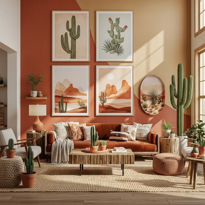
23. Colour Coordinated Art Story Wall

This layout brings together artwork that shares a similar colour palette. The pieces don’t have to match in style as long as the hues complement each other.
Why this layout never fails:
- Creates a unified visual story.
- Adds personality without clutter.
- Works in any living room style from modern to traditional.
Pick two or three main colours and keep everything within that family for the best results.
Closing Thoughts
Living room artwork has the power to transform even the simplest space into something full of personality and intention. Whether you choose a curated gallery wall, a playful free-form layout, or a bold oversized piece, the goal is to let your art reflect your style. There is no right or wrong approach. It is all about finding a layout that feels natural to you and elevates the atmosphere of your home.
When you play with scale, balance, and colour, your living room walls become an extension of your creativity. Try a few of these designer-loved layouts and watch your space come alive.


No Comments